A sustainable lifestyle brand, using
material science and smart design
to make life easier for women.
Work
Production Design / Web Design / User Experience / User Interface / Interaction Design
Creative Direction
The Girls Creative
Production Design / Web Design / User Experience / User Interface / Interaction Design
Creative Direction
The Girls Creative
Description
Everybody & Everyone is an eco-innovative, inclusive, everyday women's brand that makes life easier and was created by entrepreneur and businesswoman, Veronica Chou.
After recieving the initial desktop design direction that was established by The Girls Creative, we collaborated to design a responsive mobile design and build the user interface for a seamless e-commerce interaction.
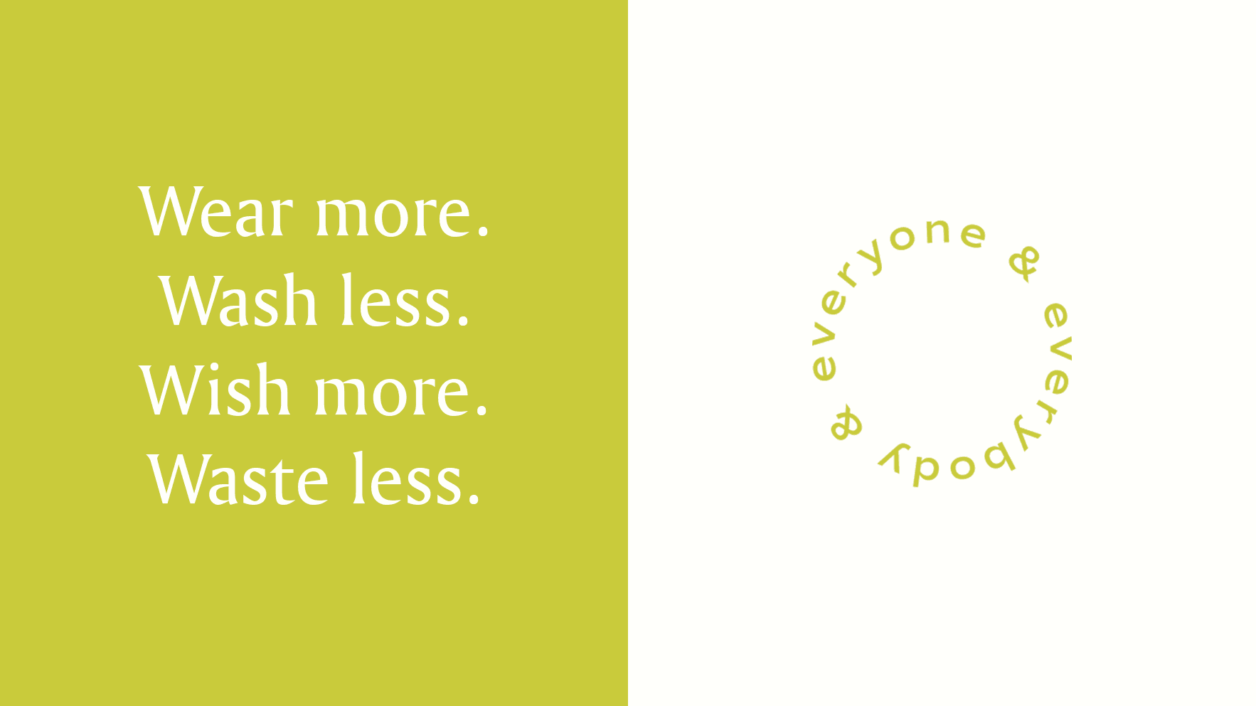
Founded by a woman—a mother, a businesswoman, a sister, a friend who couldn’t find a great answer to the question, “What should I wear everyday?” She further wanted to challenge the way that clothes are produced and to sof ten the impact of the manufacturing process on the planet. Everybody & Everyone provides elevated, everyday essentials that are made with environmentally friendly materials and processes.
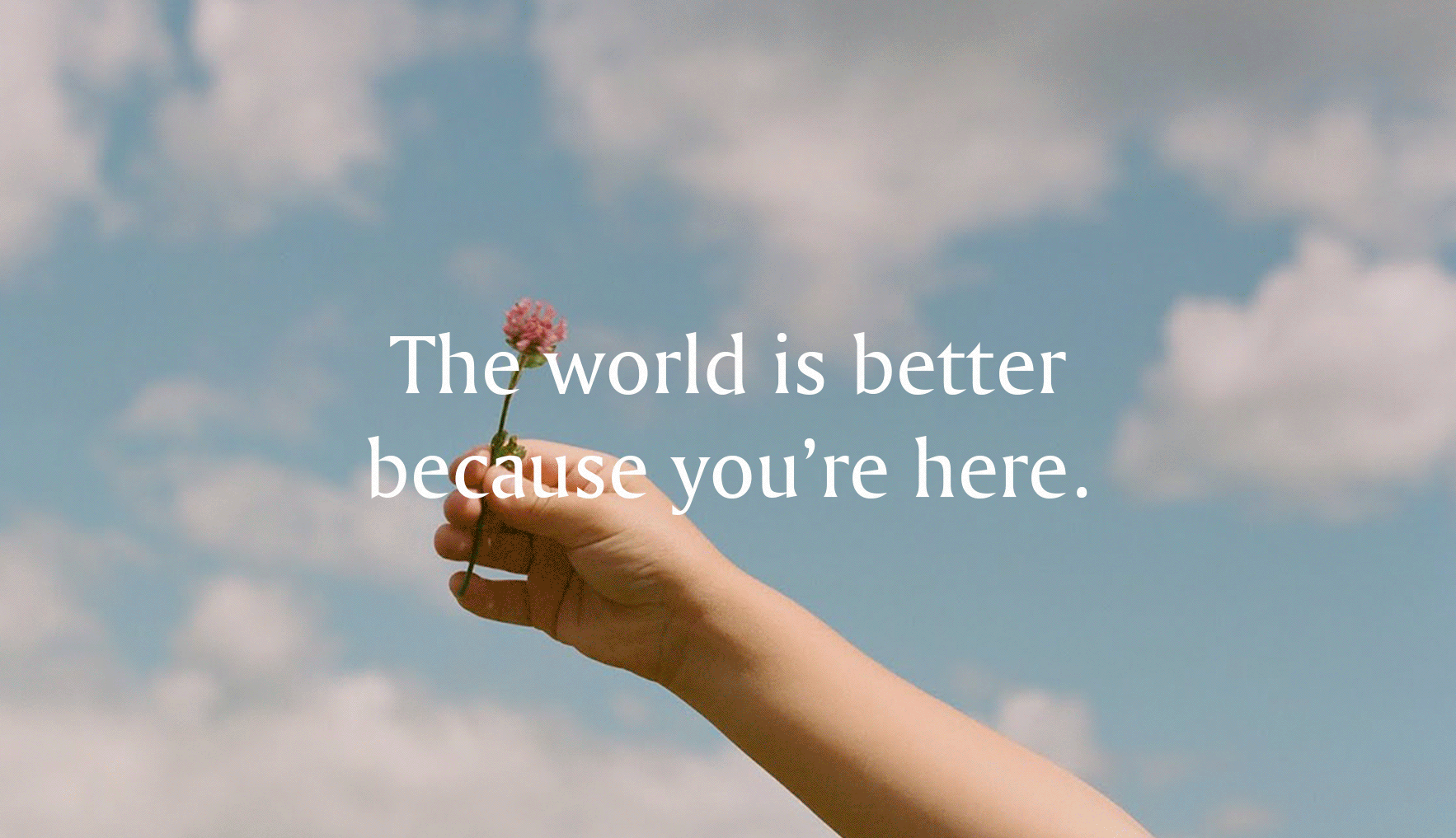


We conducted both competitor and user research to build a strong understanding of the customer's needs and motivations. We saw our consumer is a busy, modern woman with a long to-do list. She is the everywoman. We positioned the brand to bring confidence about her choices and celebrate comfort in her skin. When she buys E&E she feels good about her purchase, like she may have done something to help the planet. She feels like she looks great and is ready to face the day.

Amerigo Regular and Commuters Sans family have been chosen to represent the Everybody & Everyone brand language. Amerigo is a modern take on a serif that is medium weight, classic, and trustworthy. It works best at small to medium sizes and is to be used for body copy.
The Commuters Sans Family is a clean serif that maintains good legibility across all mediums. It can be used at all sizes. However, it is best with the thin weights are used very large, the semibold weights are used for small headlines, the regular and light weights are best for body copy and UI elements.
