
Overview
Nestlé Purina is 20th century retail pet food company that has launched a 21st century personalized dog food available exclusively online. Combining an owners' firsthand knowledge of their dog with Purina's proven nutritional expertise, consumers' create a personalized dog food, delivered direct to your door.
My Role
Lead
UX
Designer / UX Researcher / Interaction DesignThe team
Designer, Executive Creative Director, 1 UX Researcher, 1 Product Owner, 1 Scrum Master, 5+ engineers.TIMELINE
October 2022 - December 2022
About
For Just Right, one of the biggest challenges is how to reduce customer churn through subscription cancellations.During our product onboarding, we could see that Just Right was missing industry-standard cancellation deflections and subscription controls that reduce the cancellation rate and improve retention.
Task / solution
After desktop research, benchmarking interviews and surveys to collect qualitative and causative data, I recognized and synthesized few issues and topics.- Offer subscribers more flexibility on account page level: put subscriptions on hold or switch to an every other month plan (suggested in IPSY design challenge).
- Listen to why the user is leaving, and then present them meaningful offers/helps to address the reason they have stated.
- Communicate the consequences (benefits would be lost) and provide clear Cancellation path.
- Provide bigger ecosystem of support and ask for feedback.
Goals
- Reasons to believe & support for cancellation deflection
- Ease in subscription management
- Build cancellation flows for all current survey reasons
- Add and re-language reasons based on user research
- Add retention offer & education flow variants
Key Success metric
- Close the leaky funnel of customer churn, improving to 7+ month average for overall customer base.
Constrains
- Retention offer feasibility
- There are no established design patterns for UX designers to replicate
- Conflicting business and usability goals
Empathize / Qualitative Research
Open-end cancellation reasons analysis
We analyzed over 180 open-end responses to Just Right’s cancellation modal.
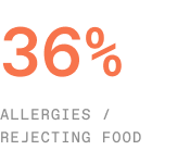
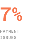
The top issues include shipping/payment failures, having too much or too little food, and pet rejection/allergies.
- Allergies or rejecting the food were cited as the top cancellation reason in this sample.
- Payment issues ( e.g. expired card, budget concerns ) motivate users to consider their subscription and cancel.
- People either don’t know how to change their delivery dates, are not being notified or both.

Empathize / User flow
Map out the user’s current journey of cancellation
I broke down the existing cancellation flow to understand why it does not work and identify opportunities to retain users.

I then mapped out the current Information Architecture that how people cancel their subscription.

The pain points of existing cancellation flow:
-
No alternatives to solve their problem of why they are deleting the account in the first place.
- Missed opportunity to gather customer feedback data to improve CAB and personalization logic.
- Doesn’t provide the user alternatives when canceling
- Flow doesn’t react to user’s reason for leaving
Empathize / Competitor analysis
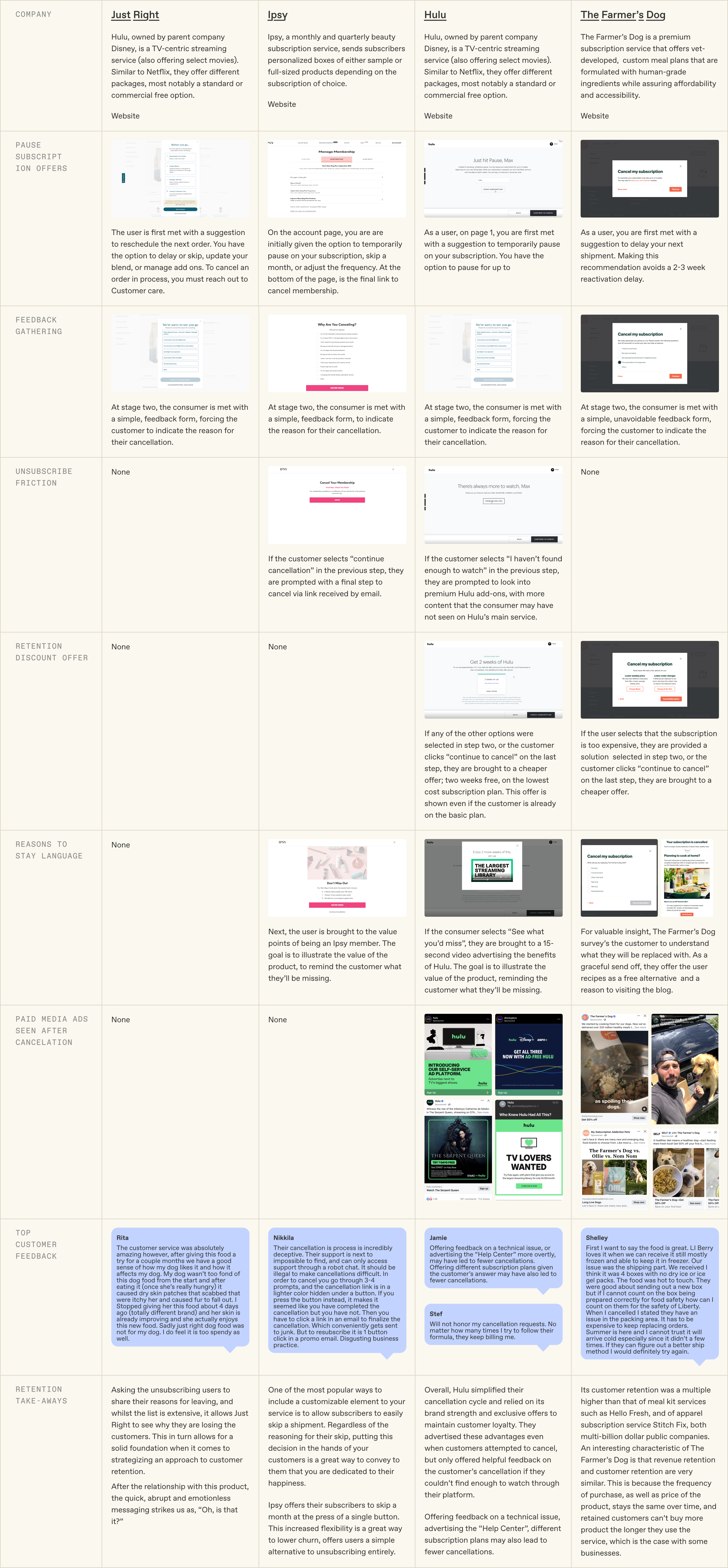
Evaluate the market’s top subscription services’ retention framework
Because no design patterns or best practices exist for offboarding user experiences, we decided to conduct a comparative evaluation of the market’s top subscription services’ customer retention frameworks, promotional strategies, CX data, and Trustpilot reviews.

Empathize / Findings & Recommendations
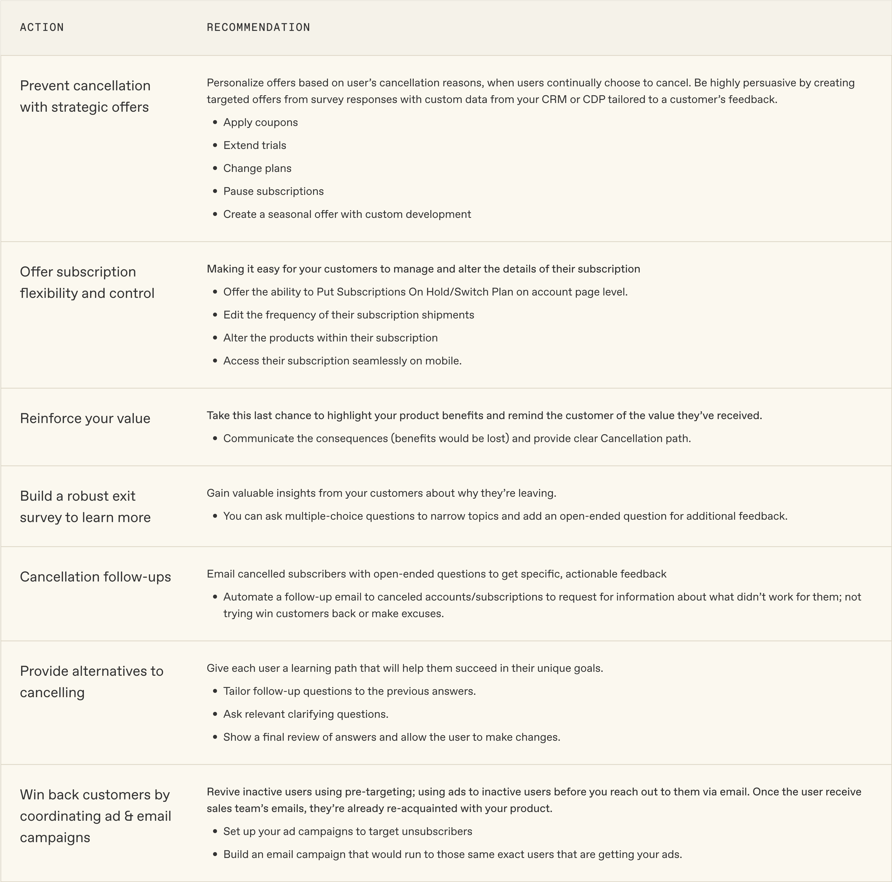
Summary of Retention Strategy Findings & Recommendations
The following strategies were discovered through the cancellation audit and the recommendations we suggest.
Define / Problem Statement
How might we implement industry-standard cancellation deflection strategies and subscription controls to effectively reduce cancellation rates and enhance customer retention?
Ideate / user journey
Meeting the user’s needs to deflect cancellation
Following collective research synthesis, we established several user goals and developed solutions to meet their needs.
- Re-language cancellation reasons based on user insights
- Offer meaningful help with a friendly tone
- Personalize offers based on user’s cancellation reasons
- Include product education and support
- Recommend alternative blends and inclusions based on dog’s experience
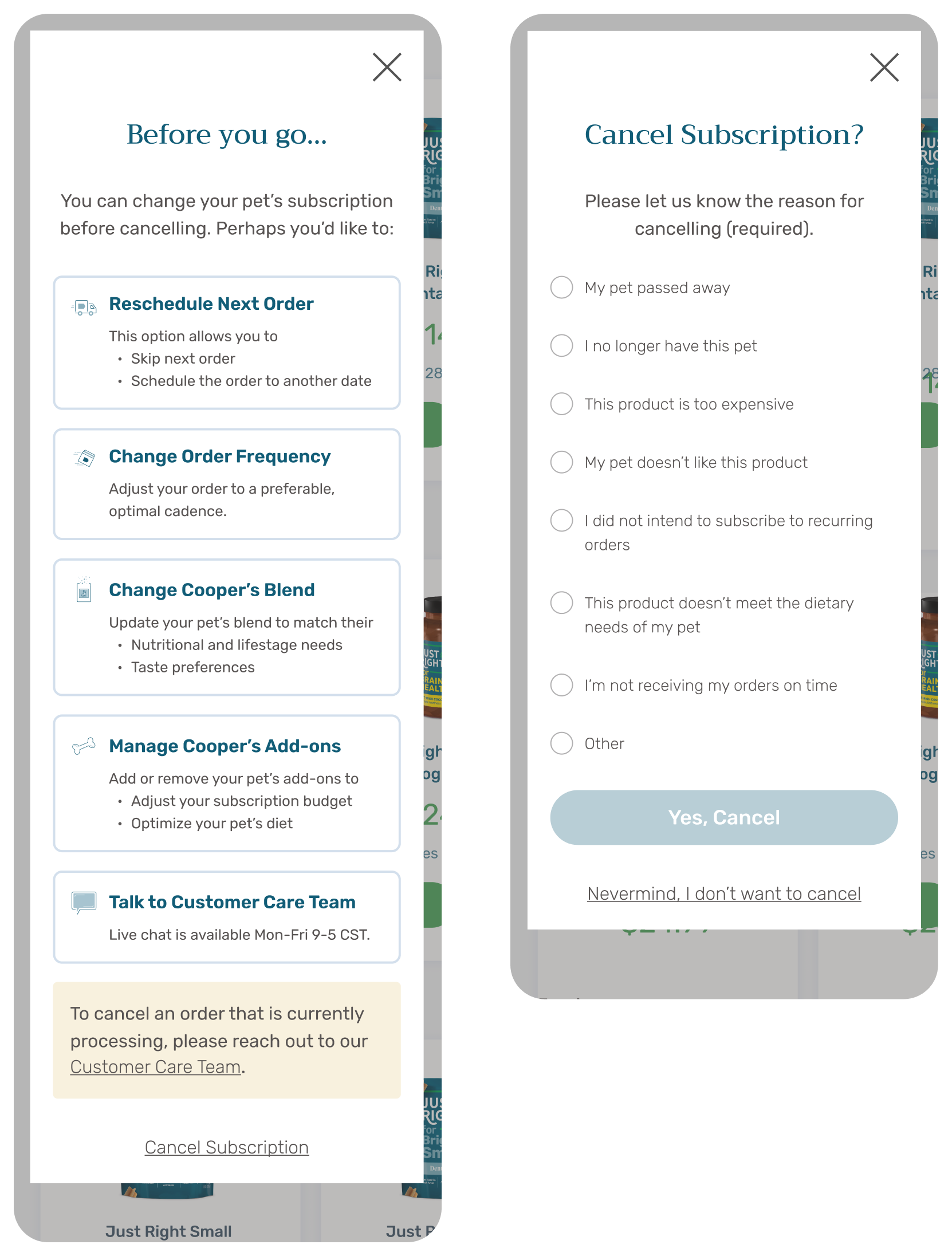
I created new journey variants to introduce help and alternatives to the user, before they determine to leave.

Prototype / UI Design
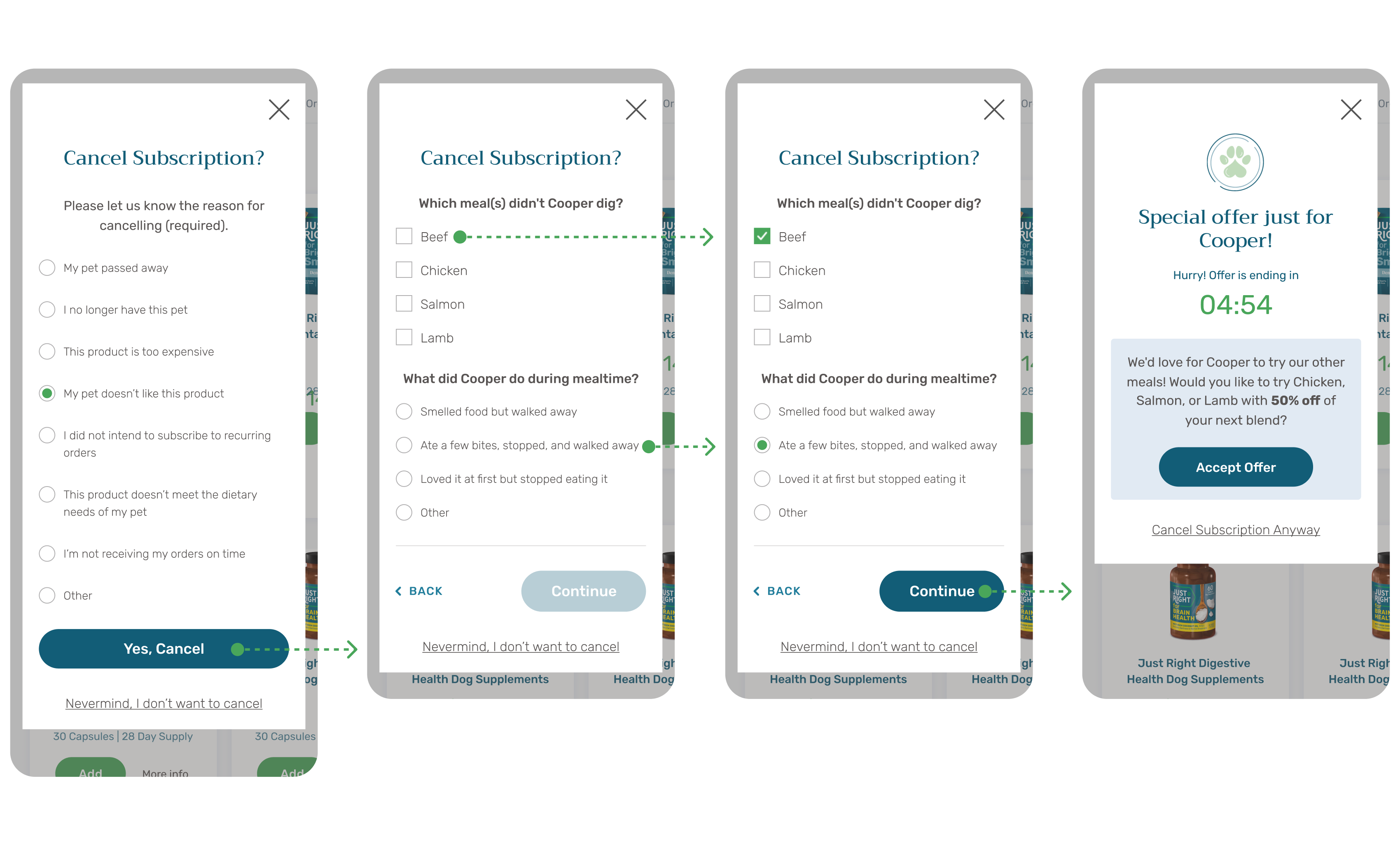
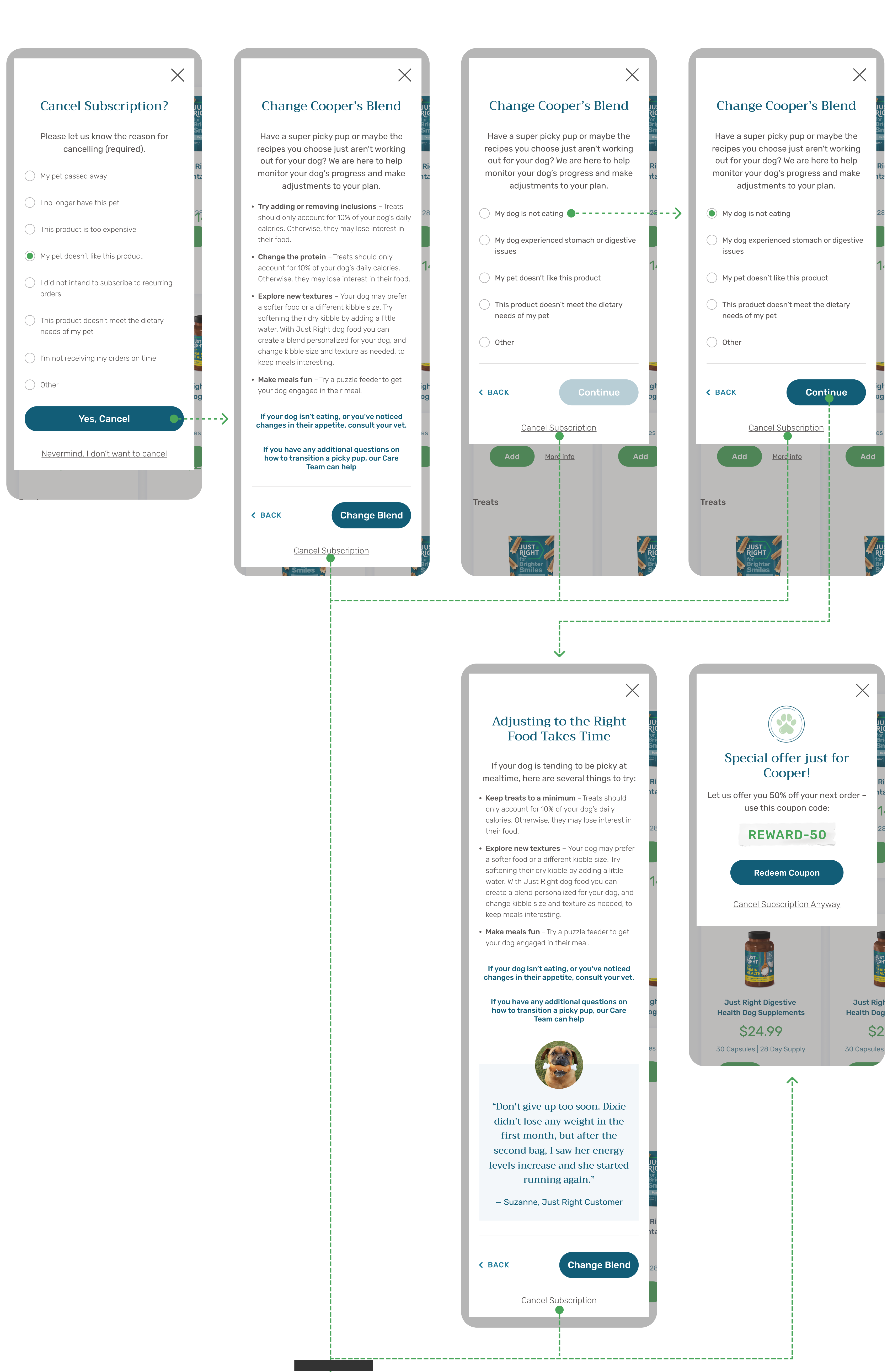
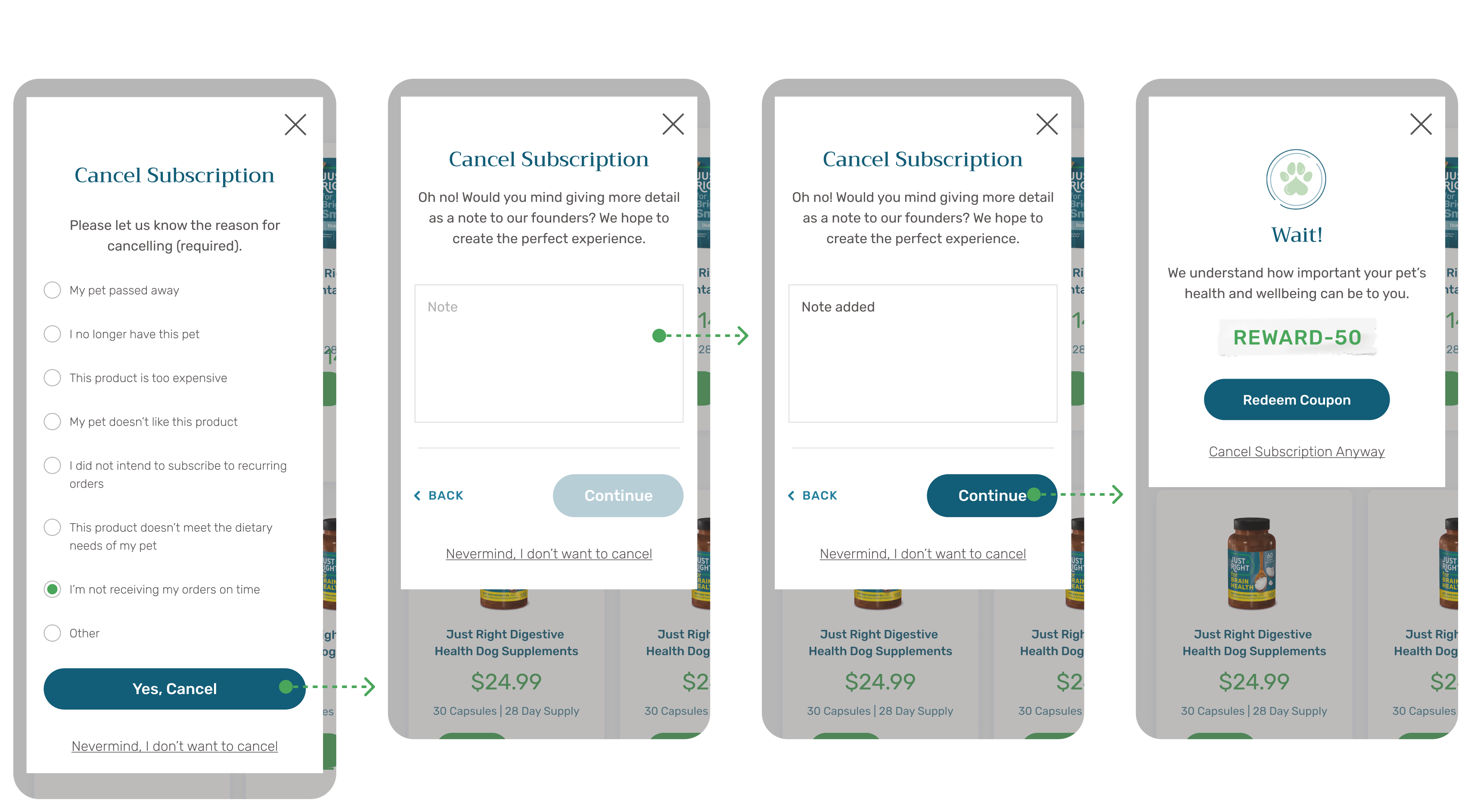
User flow variants documented for prototypes to be used in user testing
Following collective research synthesis, we established several user goals and developed solutions to meet their needs.
Change order frequency / reschedule order / Cancellation offer
![]()
Pet Doesn’t Like / Protein Survey / New Blend Offer
Pet Doesn’t Like / Change Blend / Transition Tips / Cancellation Offer
Dietary Needs / Cancellation Offer

Too Expensive / Pricing survey / Cancellation Offer

Order Delays / Detail request / Cancellation Offer
Retrospective
If I were to continue work on this project, my next steps to refine our strategies, optimize user experience, and improve overall retention could include:
- Conduct A/B testing to evaluate alternate approaches and determine their impact on user satisfaction and cancellation rates.
- Introduce greater plan flexibility for subscribers to change their plans based on their feedback and blend data, enhancing user experience and retention.
- Explore innovative solutions that more precisely address canine needs, ensuring that personalized blends effectively support the health and well-being of dogs.
